2018 Year in Review: Taking Bloomington’s temperature
The second half of December in Bloomington, Indiana, might have felt a little warmer than normal. How can that sort of gut feeling be checked against reality? What does “normal” even mean?
One place to start is the Applied Climate Information System (ACIS), which was developed and is maintained by the National Oceanic and Atmospheric Administration’s Regional Climate Centers. The ACIS data interface makes it easy to retrieve information in some weather categories back to the 1800s.
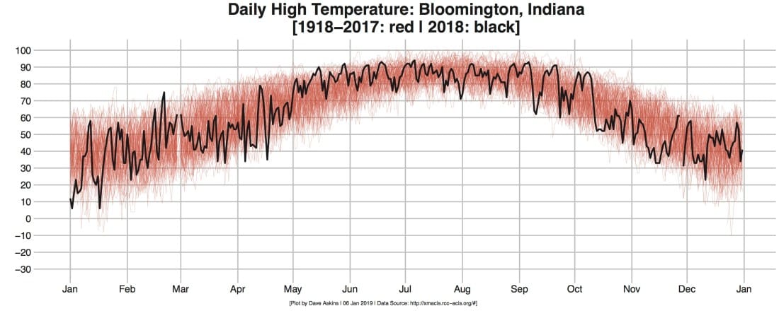
To get a rough idea of how the past year’s temperatures stacked up against previous years, we grabbed a century’s worth of daily numbers from ACIS and plotted them all on the same charts.
The colored snarl of lines in the charts give a sense of the “normal” range of daily high (red) and low (blue) temperatures through the past century. The black lines in the plots show the numbers from 2018:


Eyeballing those plots, the second half of December last year does look like it was a bit warmer than normal.

Comments ()