New seal for Bloomington would mean city is no longer nucleus of Hoosier atom


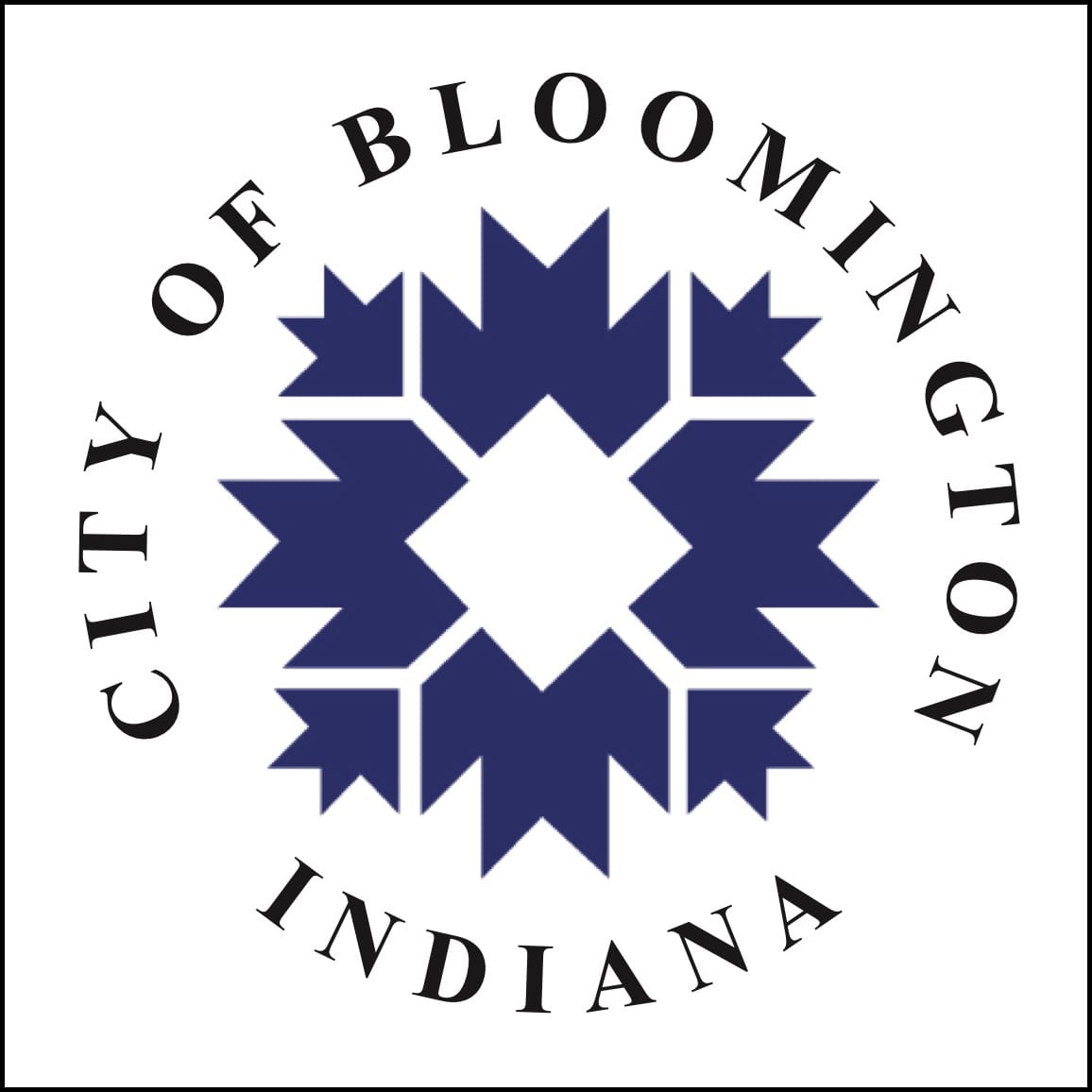
A new official seal for the city of Bloomington could be adopted sometime soon. The new seal would be based on the ubiquitous city logo, which was adopted by a resolution of the city council in 1986.
According to the text of the 1986 resolution, the logo was designed by Timothy Mayer, former member of the Bloomington city council. The logo design predated his elected service, which spanned two decades, from 1997 to 2017. The logo design came during the first stretch of Mayer’s long city council service. He served from 1984 to 1987 and again from 1997 to 2017.
Often described as a snowflake, the city logo was inspired by quilt patterns predominantly used by regional folk artists during the 19th Century—it’s a combination of the peony and the trout lily, according to the 1986 resolution.
The square in the center of the design signifies Bloomington’s downtown square and community interaction, according to the resolution.
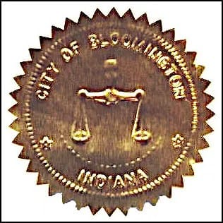
The featured image on the seal that is currently used by city clerk Nicole Bolden includes the scales of justice. Bolden told The Square Beacon that it dates from the era when the clerk also served the courts that used to be a part of city government.
The seal goes on marriage licenses, funeral deeds, oaths of office, encomiums, certifications of legislation, bonds and other insurance documents for the city.
Why did Bolden put the idea of a new city seal in front of the city council’s administration committee on Tuesday?
During a certification class, she learned that the city seal is supposed to be replicable, so she decided to buy a stamp—and she wanted to make sure she had the right image.
That led her down a “rabbit hole,” she said. At the bottom was the atomic era of 1971.
The city’s website includes an archive of ordinances dating back to 1950. Bolden found an ordinance from 1971 that described in words what the seal is supposed to look like. But the half-century-old ordinance did not include an image to go with the written description.
Bolden tapped the expertise of graphic artist Danielle Riendeau to create some mockups.
Riendeau generated several variants, because the wording is ambiguous in places. According to the ordinance, “The motto of the City of Bloomington, ‘Indiana’s Cultural, Educational & Recreational Center’ appears around the edge of the inner circle.”
Does that mean it should go inside the inner circle, or outside the inner circle but inside the outer circle?
What’s common across the variants mocked up by Riendeau is the way the location of the city of Bloomington is depicted on the map of Indiana. It corresponds to a sentence in the ordinance: “The atomic symbol is placed on the map in the appropriate location to represent the City of Bloomington.”
Bolden described the old seal design as “very 70s.” The old design did not appear to have any traction with Bolden or committee members.
Bolden’s recommendation is for the council to adopt a design for a new seal that uses the city’s familiar peony-trout-lily logo.
Reaction to Bolden’s suggestion from administration committee member Jim Sims at Tuesday’s meeting was positive: “This is non-controversial, pretty easy. Let’s do it. I think it’s simple. Let’s do it.”
That would mean slotting onto a future city council agenda an ordinance that adopts a new seal. If it’s not a pressing matter, Sims said, it could be put off. But Sims encouraged dealing with it quickly.
On the question of urgency, Bolden said, “I would like to order a new seal.” That way she could seal documents without carrying around the heavy iron device for the current seal design.


Comments ()