Honk, if you’d like Bloomington’s traffic counts

On an average day, 2,526 cars drive along the section of Morton Street between 7th and 8th streets in downtown Bloomington.

Measured just a few months ago, that’s one of the freshest numbers in Bloomington’s traffic count dataset. That dataset and others are available through the part of the city’s website that is branded as B Clear Open Data.

As Bloomington gears up for some mid-June public meetings about the College and Walnut corridor, traffic counts are one kind of information that residents might like to have in a handier format than a bunch of rows and columns.

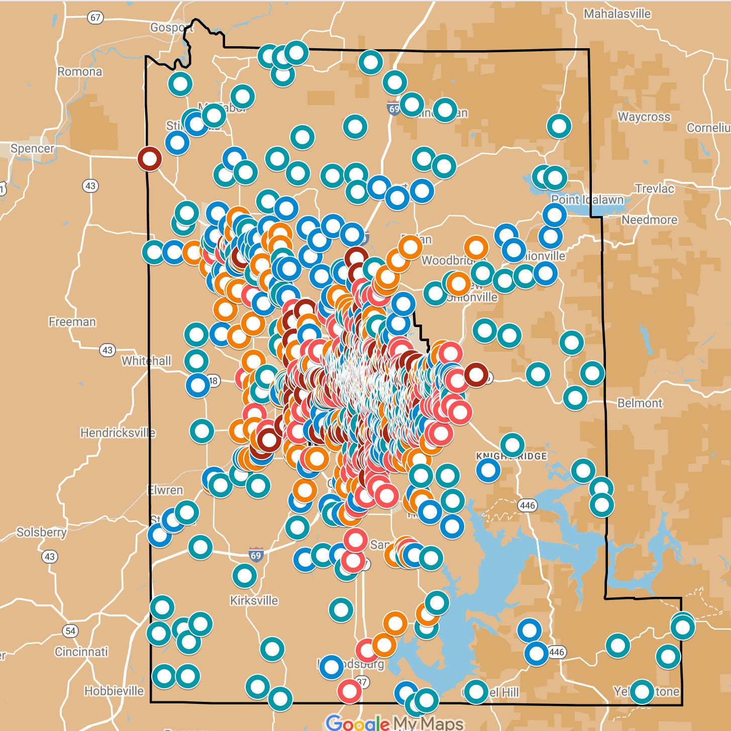
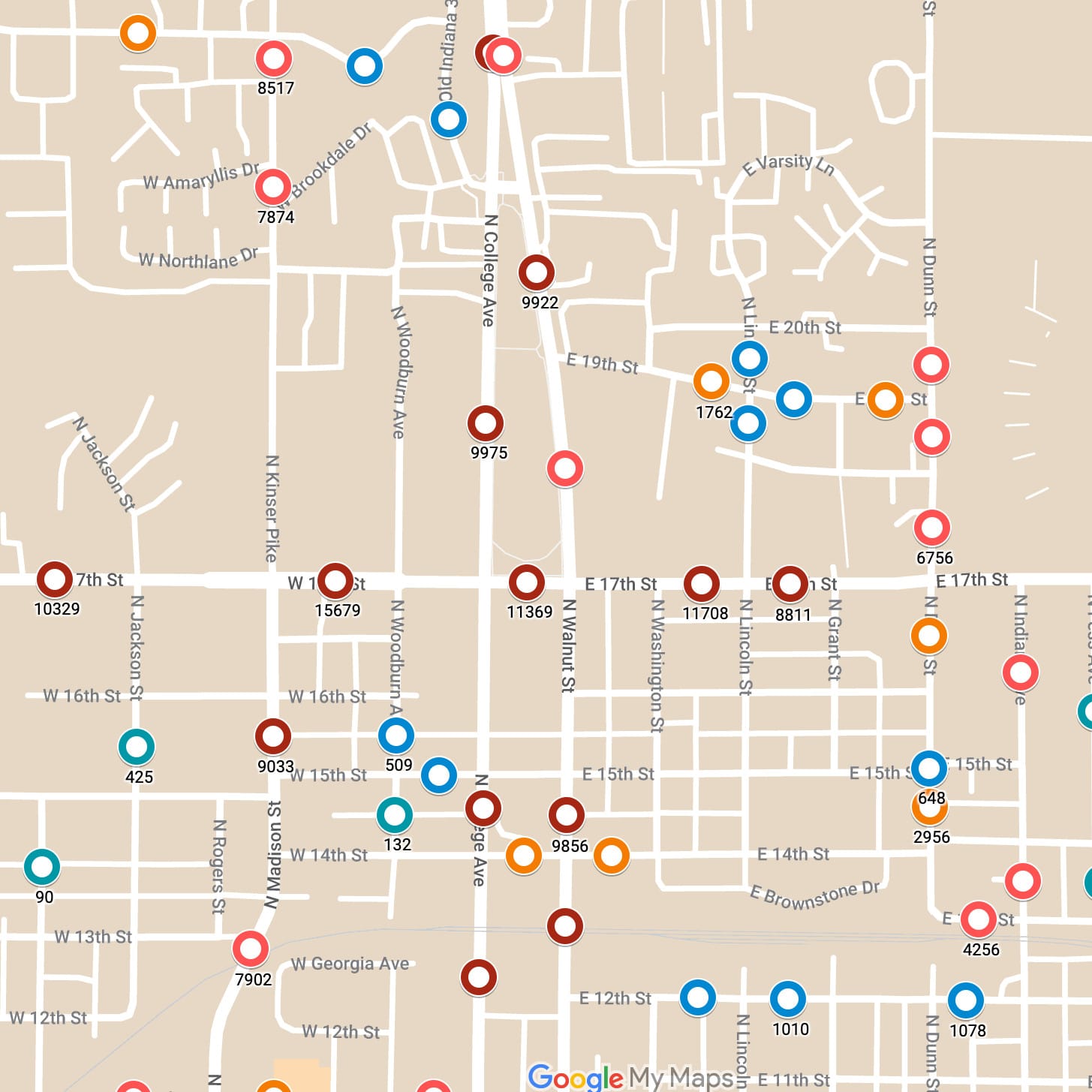
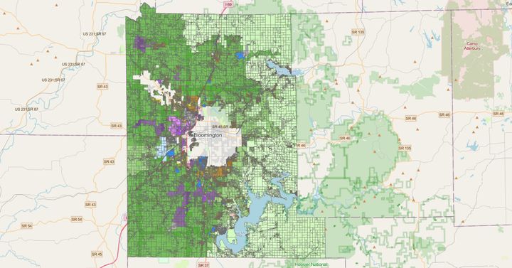
To serve that potential community interest, The B Square has built a Google Map  showing the locations of all the traffic counters  in the B Clear traffic count dataset. Click on a colored dot, and a sidebar will appear, showing the traffic count tally, as well as the year when the count was done.

On June 13, from 6 p.m. to 7 p.m. in city hall, there will be a public meeting to discuss the existing conditions along the College and Walnut corridor. Two days later, on June 15, from 6 p.m. to 7:30 p.m., another public meeting is scheduled, to discuss design concepts.

Those public meetings follow a few weeks of information gathering by city staff, using online surveys and in-person talks.

The dots on the traffic counter map are assigned colors on the map based on the average daily traffic count at that location:

Green: 10 to 450
Blue: 451 to 1,345
Orange: 1,364 to 3,582
Light Red: 3,586 to 8,523
Red: 8,578 to 27,052

For readers who want traffic count numbers that are more recent than the numbers in the B Clear dataset, in some cases the Indiana Department of Transportation (INDOT) traffic count database offers fresher figures.

The original B Clear dataset is missing the latitude-longitude coordinates for some of the locations. For our map, The B Square has manually geocoded the missing locations based on the descriptions in the dataset.

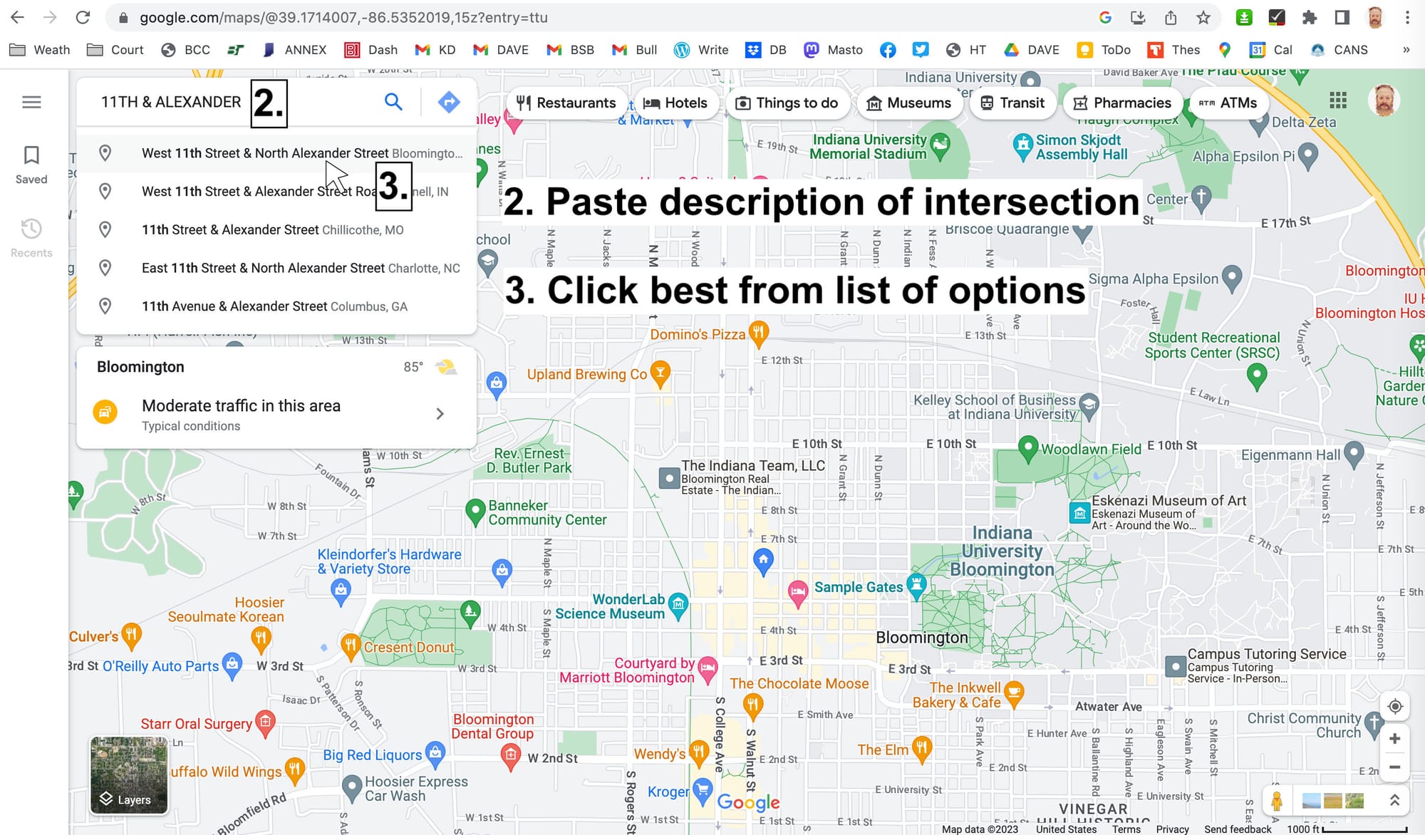
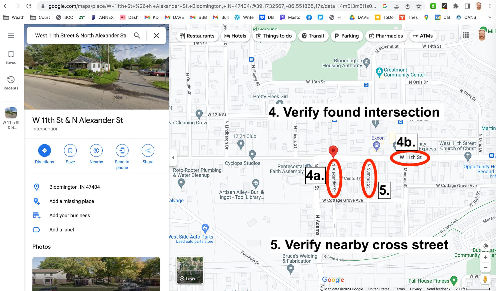
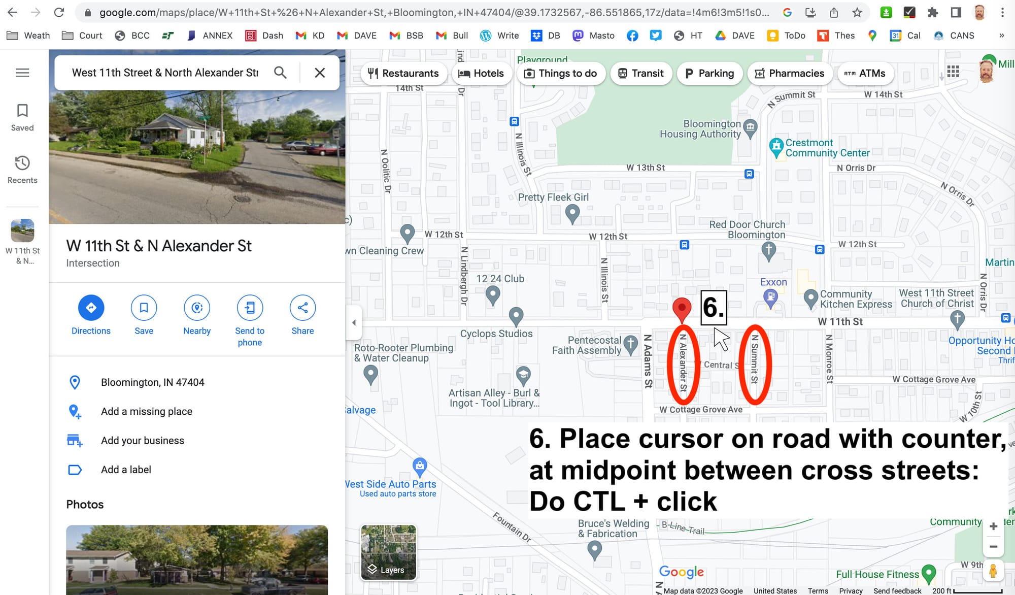
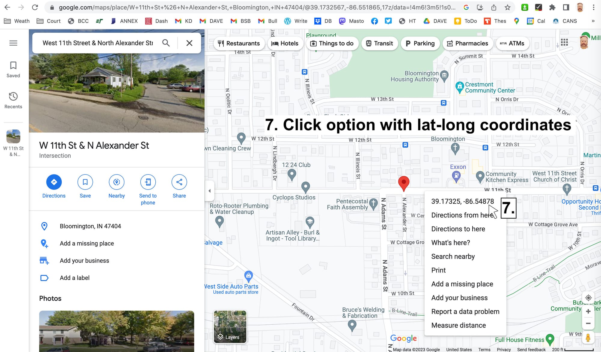
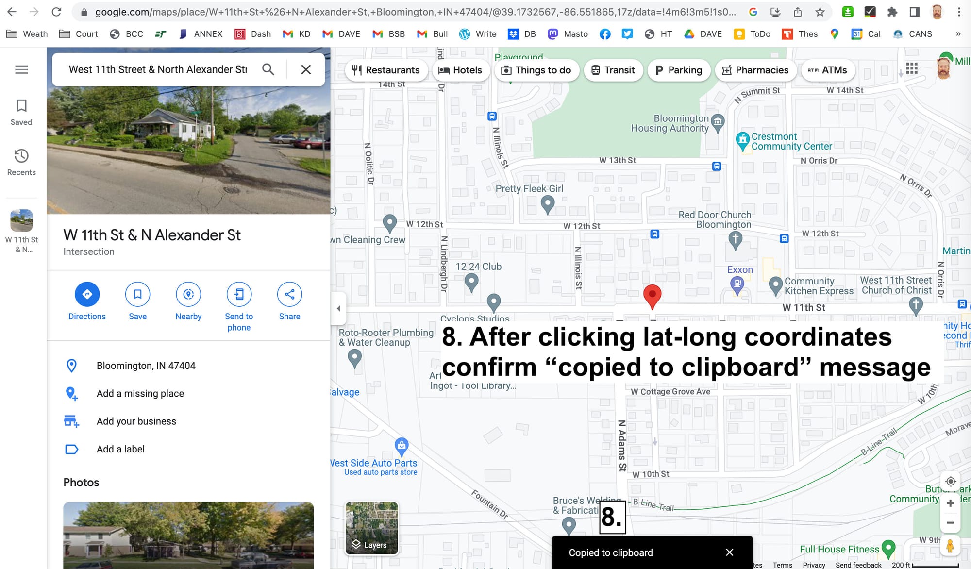
Google Maps offers a straightforward way to find the coordinates of any point on a map. Use CTL-click (Mac OS) or right-click (Windows) on any map point, and a menu will pop up, showing the latitude-longitude coordinates as an option to pick. Clicking on that option will automatically copy the lat-long information to the clipboard. It can be pasted anywhere you like, including the cells that are missing lat-long coordinates in a dataset.

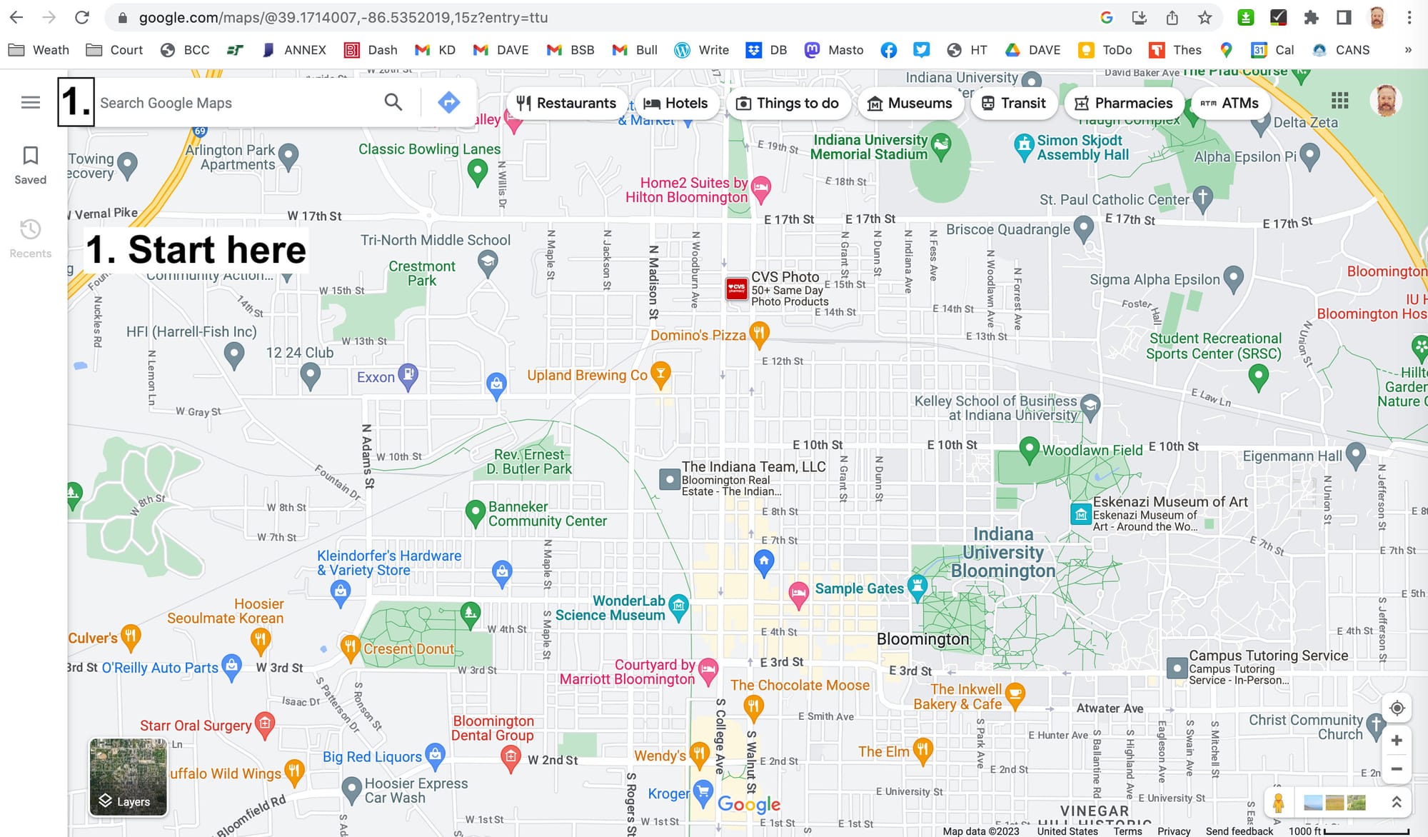
Traffic counter locations are described in the B Clear dataset in a natural way—on Street X, between Street Y and Street Z. To conduct an efficient search for traffic counter locations in Google Maps, it’s useful to specify an intersection—like “Street X & Street Y”. After Google Maps serves up a placemark for the intersection and zooms in for a closer look, the other cross street (Street Z) can be found by visual inspection.

Below is a series of screenshots showing how that process can work.

9 thoughts on “Honk, if you’d like Bloomington’s traffic counts

  1. I’m amazed at how you inform us! Thank you. Didn’t we cover the two-way issue for Walnut & College w the Transportation Plan? Delivery trucks cannot just arrive when we choose. I hope we ask delivery drivers or companies before implementing such a change. Thanks again for your good journalism.

  2. “On an average day, 2,526 cars drive along the section of Morton Street between 7th and 8th streets in downtown Bloomington.”
    Yet the city refuses to paint a center line on the street. Cars are constantly driving down the middle of the road. It is just by luck that there has not been more wrecks.

    1. unfortunately i can’t offer any particular knowledge about the planning process for morton st (though i can tell you, it will be narrowed a little bit at 8th or 9th street soon in order to improve visibility at the intersection). and i also don’t have an engineering study handy about centerlines. but here’s an article for the lay public about it: https://www.strongtowns.org/journal/2016/10/31/ask-r-moses-does-center-line-striping-make-streets-safer

      the basic theory is that when there is a center-line, drivers drive faster because they believe there is a guarantee that the lane will be clear for them. and they drive more aggressively because they begin to see themselves as authoritarian dictators of their lane that has been given to them by this stripe of paint. but the counter-fact is that, like you say, drivers face genuine difficulty deciding where to drive, and confusion can be a risk too. so you’ve got competing risks, it’s a trade-off, a balancing act. there’s no perfect answer.

      but i will say i just did a tiny traffic study n=1 and i can tell you at least one driver drives more cautiously on morton street because the center line isn’t there: you. you just told us, directly and in as many words, that the lack of a centerline makes you more fearful on Morton. it’s not a big jump for me to assume that therefore you drive more cautiously, more alertly, and more slowly as a consequence.

      i know it seems kind of inhumane to get drivers to slow down by scaring the pants off of them but unfortunately it not only works but it’s just about the only thing that does. and slowing drivers down is the number one way to prevent wrecks and to reduce the severity of them when they happen. strange world we live in.

  3. this is awesome! i have been looking at the traffic counts for more than a decade and never had such a good view of it

    on an only vaguely-related note, i found out what happened to the crash statistics on b-clear. i thought they had gotten lost in the technology transition to socrata so i badgered the guy who did a lot of that work, and he tracked it down… it turns out, the city gets that information from the state (or from someone the state contracts with??) and was never actually allowed to share that data with all of us. so we only got it by luck until that policy caught up to us. i suspect that Carson TerBush’s excellent work unfortunately brought it to the attention of someone who clamped down on it.

    just figured someone else was probably wondering that too

  4. You can also visualize the traffic count data directly on the B-Clear site. The interface is quite nice. I’ve created one which I hope I can share but you have to request approval for sharing it.

  5. When I clicked the google link to this data it looks like most of the counts are 10 to 15 years old. I hope we are not making policy decisions based on these maps.

    1. it’s complicated. mostly, what this map shows, is that they keep around the old data…which is way better than throwing it out. but you’re right they have to take the old data with a grain of salt.

      generally, the overall patterns hold true over time but obviously the details will change tremendously from a new apartment building or whatever. so i think planners do use old data for general purposes. but when they are doing a detailed study on particular intersections, they really like to have more recent data. and you can see both of those trends on 7th st north of downtown…some of the data is very old and some of it is very new because they wanted to get new numbers as part of deciding to put the stop sign back at 7th & dunn. so they got new data, but all it did was confirm the old data..the numbers are basically the same since 1999.

      and you can see it on allen street between patterson and rogers as well. they are installing traffic calming there (“allen st greenway”) so they did a new count last year. and that’s basically the same story for all of the dots on the map. at some point, they had a specific project in mind so they performed the count, and this just shows that they kept that data around just in case it might be useful again. it’s not as good as a new count but it’s a lot cheaper than constantly repeating counts when you don’t have a specific project in mind. they definitely don’t have the staff resources to count all the streets on a regular schedule (i wish they did).

      and i wish i knew more but i do know they have a lot more counts and a lot more data than is really represented on this map. for individual projects i have seen intersection studies that will have individual counts for all of the different turning movements, there will be 16+ counts for one intersection. but on this map all of that would probably be reduced to at most 4 numbers and i think some of them are not even present at all. and a lot of times they do counts that also include speed data, which also isn’t here. so they take a lot of things into account and it can get very complicated.

Comments are closed.