A peek under the hood of the ISDH COVID-19 data dashboard as Indiana’s health department preps to release race data
At Thursday’s daily press briefing on the COVID-19 public health crisis, Indiana governor Eric Holcomb recited some numbers with literally biblical proportions.
Holcomb led off quoting Matthew 18:20: “It says, ‘For where two or three are gathered together in my name, there am I.'”
Holcomb added, “And of course, that’s a pretty powerful reminder that it’s two or three, not 200 or 300 or 3,000.”
Holcomb’s point was to encourage residents of the Hoosier state to celebrate Easter this coming Sunday with their nuclear families, not in large crowds, to respect the strictures that have been put in place to curb the spread of the pandemic virus.
Serving as a kind of statistical reference bible for the press briefings is the website dashboard that’s maintained by the Indiana State Department of Health for COVID-19 confirmed cases, tests, and deaths.
From the dashboard, Kristina Box, the state’s health commissioner, delivered Thursday’s somber news: 42 more were dead from the virus across the state.
On Thursday, Box previewed some numbers on the race of COVID-19 victims, fielded questions about the way death statistics are presented, and other queries from journalists made possible by the data in the dashboard.
A question of race
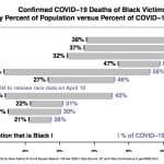
Responding to a question about the race of those who’ve died of the COVID-19 virus across the state, Box indicated that she’d likely have information on Friday that she could release. She said it would show the same kind of disparity found in other places.
The Associated Press reported recently on significant gaps between the percentage of Black patients who have died compared to the percentage of Black people the population of a place. That’s a generalization confirmed for states like North Carolina, Illinois, Alabama, Michigan, District of Columbia, Louisiana and Mississippi.
Box said one of the challenges in piecing together the data on race is that laboratories will check “unknown” for the race of the patient—as often as 40 to 50 percent of the time. So her department has to track down the race of the patient, Box said.
Checking “unknown” for race is a familiar challenge in other contexts, like law enforcement, but not necessarily on the scale that Box described. In Bloomington’s B Clear Data Portal, the race of people who are cited is coded as “Unknown” about 15 percent of the time.

Date of death
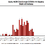
Box reported the number of new COVID-19 deaths at 42. But the dashboard for Thursday showed just three deaths for the previous day. She fielded a question about that from a reporter on Thursday.
Why is there a mismatch between the number of deaths in the daily announcement and the figure listed for the previous day on the dashboard? The difference arises because ISDH logs the deaths by the date the person died, not the date when it received the report about the death.
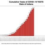
A parallel principle applies to tests. They’re logged by the date the specimen was taken, not the date the result was reported. As testing turnaround gets faster—possibly to the point that the specimen is taken and the result reported on the same day—the lag could become a moot point. For now, when the dashboard gets updated every day at 10 a.m., the numbers of positive cases and deaths for previous days will reflect several adjustments that get made to the historical data.
When the dashboard was first launched, no historical data was included. Journalists who wanted to report on the day-by-day progression of the disease had to maintain their own record of the cumulative totals. But analyzing the increment of each day’s cumulative total as the “daily number,” could not reflect the kind of epidemiological precision that dashboard now tries to capture.
Asked by a reporter on Thursday if declines in daily new deaths for the last three days—11, 10, and 3 deaths—was reason to think the pandemic was waning, Box said no. She’s not that optimistic.
About that day’s statistics, Box said, “These are incredibly sobering numbers and they’re a stark reminder that we have not reached the peak of this pandemic in the state at this time.”
The animation below shows three days worth of daily data for deaths. Apparently declining numbers for recent days, might not be declining at all, because of lags in reporting.

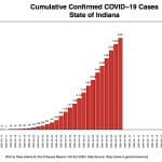
The cumulative increase in confirmed cases for Indiana appears to have settled into a linear pattern, not an exponential one. But that might just reflect a similar trend in the pace of testing.


Pace of testing
For couple of weeks now, at the daily press briefing , the slow pace of testing in Indiana compared to other states, has been a focus of questions from reporters.
Box has described the capacity for testing statewide at around 3,700 tests a day. After peaking at 3,535 tests done on April 5, the number of tests done after that has declined every day: 2,567 on April 6; 2,103 on April 7; and 1269 on April 8.
Asked about that testing decline on Thursday, Box said the maximum number of tests are not being submitted to the state—that is, it’s not because the state is refusing requested tests.
The criteria for those eligible to be tested has been relaxed somewhat. People are required to be symptomatic, and priority is given to health care workers and first responders.
Box said on Thursday there’s required form associated with testing that will be eliminated starting next week. That could increase the number of tests being done.

Per capita rate of infection
 Because the state’s total capacity for testing isn’t being tapped by health care providers, Box said that the state is targeting areas of the state, focusing on long-term care facilities, and doing testing where it’s needed.
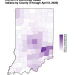
One of the areas where testing has been offered, according to Box, is Decatur County which has the highest per capita rate of COVID-19 infection in the state, at around 4 people for every 1,000 residents.
Combining ISDH dashboard data with US Census population estimates for 2019, yields a plot that shows a higher concentration of COVID-19 cases in the southeastern heel of the state, where Decatur County is located.
Demographics
The race data that is supposed to be released on Friday could join age and sex data that’s already available on the dashboard.
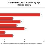
An age distribution is presented on the dashboard for the whole state. County-by-county numbers are available in the data feed that is tapped by the dashboard for its display.
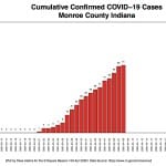
For Monroe County, the 20-29 year old category was the most prevalent age range for the 61 confirmed cumulative cases that were reported on Thursday’s dashboard.

Monroe ranks fifth among Indiana’s 92 counties for percentage of confirmed cases in the 20-29 age category. The top five are: Crawford (27%), Daviess (25%), Gibson (25%), Vanderburgh (24%), and Monroe (23%)
Data feed
Numbers are supplied to the ISDH dashboard through a separate URL that uses the .topojson format. It’s a format that can be converted to the more familiar comma separated value (.csv) format with free online tools.
[Updated: April 10, 2020 at 5:02 p.m.] The Indiana State Department of Health announced at the daily press conference briefing by the governor’s COVID-19 team that the number of Black victims so far is 19 percent of the total. That stat has been incorporated into the chart below.


Comments ()