
Editor’s Notebook: Proposed new Bloomington logo looks like a butt
Bloomington paid $95,000 for a new visual identity that is polished but generic—and whose giant “B” looks unmistakably like a butt. The city council should use its power of the purse to stop the administration from spending even more to put it everywhere.
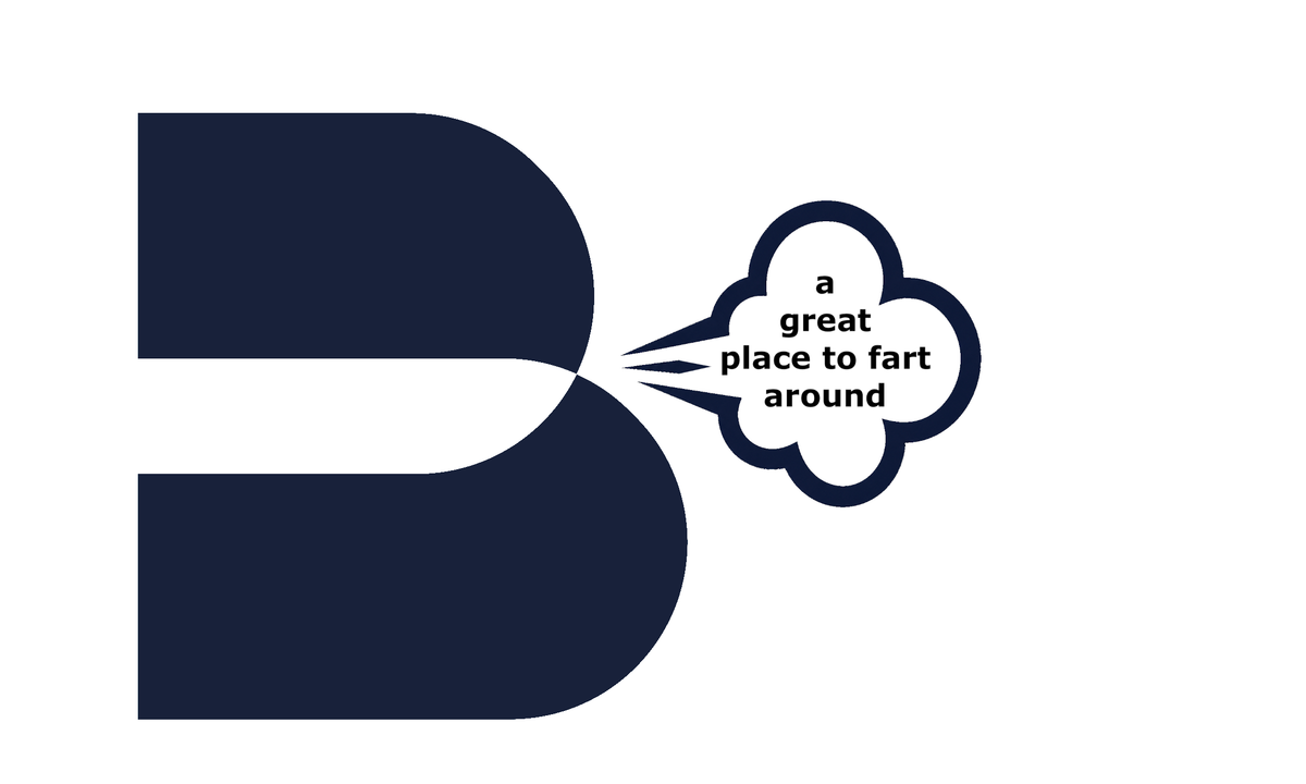
There are some features of Bloomington’s proposed new visual identity that suggest it was probably not developed by rank amateurs.
The color palette that CivicBrand has developed is attractive. The heavy sans-serif typography is contemporary but not fussy. The giant geometric “B” is simple enough to work on a website, a truck, a T-shirt or a sign. It can be reproduced in one color. It will survive shrinking to the size of an app icon.
Those are real virtues. And the consultants have built a coherent visual system around it.
But I don’t think we paid $95,000 for a competent graphic design. We paid for a distinctive brand.
That difference matters.
A good city logo does not have to contain the courthouse dome, a limestone block, a bicycle, a tree or any other literal Bloomington symbol. In fact, trying to incorporate any of those iconic references would almost certainly be a mistake. But if the design is going to be abstract, the abstraction still needs enough personality to become unmistakably ours.
This one dramatically fails that test.
The B is handsome, but completely interchangeable. By itself, it could theoretically belong to a bank, a bus company, a technology startup, or myriad other types of organizations with names that begin with B. The existing marks for an app, a law firm and a boat-listing website are remarkably similar to the design that CivicBrand is recommending for Bloomington.
The proposed logo’s lines are clean, but the negative space created by the two big, curved pillows doesn’t do any work in service of a brand.
Sure, it looks professionally designed. But it does not look much like Bloomington.
That is a problem when the branding document itself talks about preserving the “talent, energy, and identity that make [Bloomington] special.” The strategy promises distinctiveness. The symbol delivers only generic competence. But there is another problem.
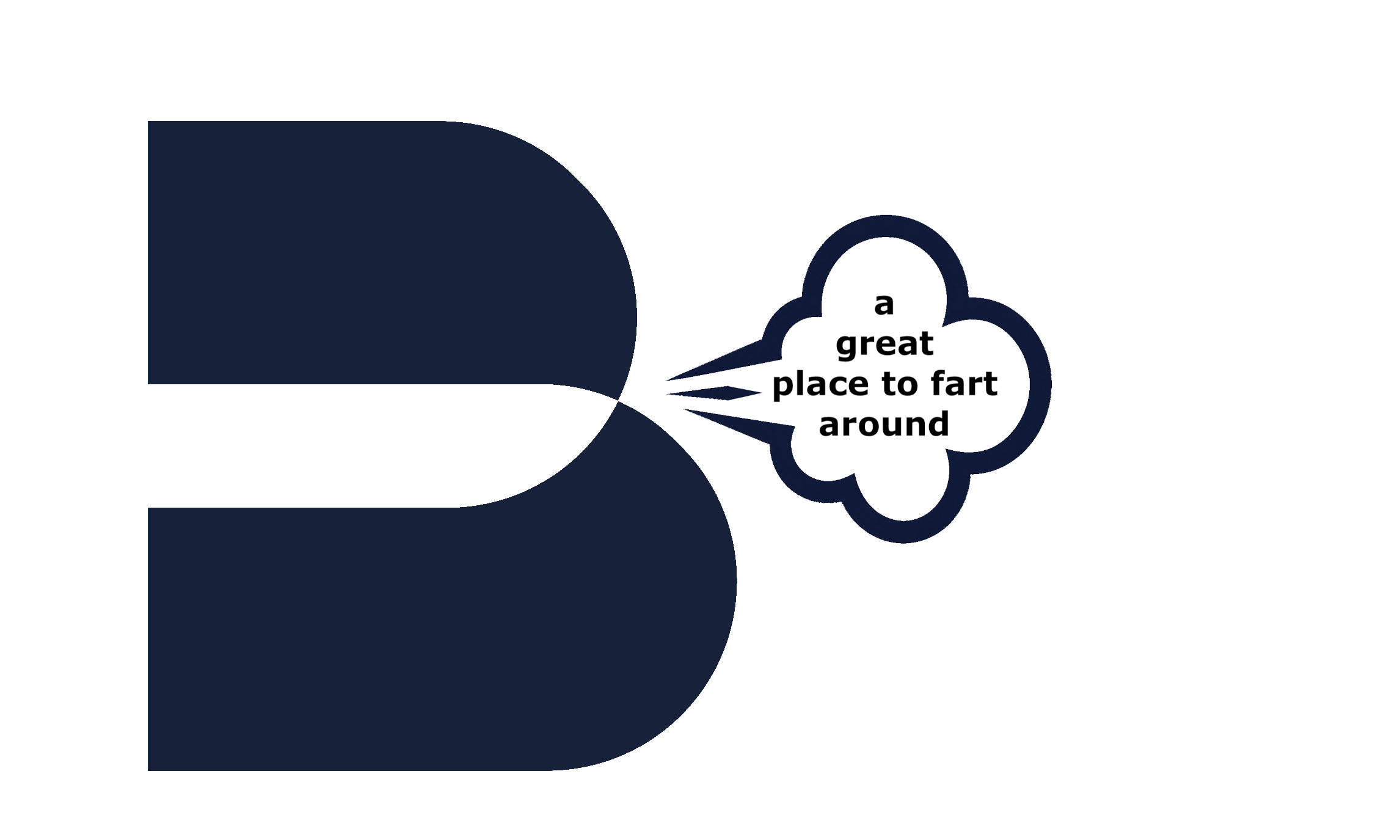
It looks like a butt.
Once seen, you can’t unsee it. The two enormous rounded lobes, pinched together at the center, do not just allow that interpretation. They practically invite it. Add a little puff of air at the point where the two cheeks meet and the logo is transformed into an illustration of Kurt Vonnegut’s famous line: “We are here on Earth to fart around.”
Rotate the logo 90 degrees clockwise, and it cannot be denied: It’s the image of someone using the common technique of lifting one butt cheek to quietly release a fart.
At some point, any proposed new logo should be shown to a focus group of some teenagers. Or elderly men like me who can reflexively adopt the mindset of a teenager. And if this one had been properly vetted, the butt cheeks would have been spotted as a problem to be solved with further refinement.
What makes this hard to laugh off is the way the city has handled the work itself. The city has twice refused to release the completed branding materials in response to formal public-records requests this year, even after the $95,000 contract was paid in full in November 2025.
So the public was in the odd position of having paid for the branding work, but was not allowed to look at it through the ordinary public-records process.
Bloomington councilmembers should keep that in mind when the administration presents the logo at the council’s regular meeting next Wednesday (Sept. 2).
The $95,000 is gone. That is not an argument for spending more. New signs, vehicle graphics, uniforms, printed materials, and myriad other applications could turn a dumb design into an unnecessary expense.
The council does not need to declare the logo is ugly. I don’t think it is ugly.
Councilmembers should ask a simpler question: Is this mark distinctive enough, durable enough, and unmistakably Bloomington enough to justify paying to put it everywhere?
I don’t think it is.
The council has the power of the purse. It could prevent the rollout of the branding package by prohibiting any spending to support it.
Mayor Kerry Thomson’s administration already made taxpayers fund a literally half-assed branding package. The city council should refuse to put another half on the public dollar.



Comments ()